Directions: Read the information and answer the questions that follow.
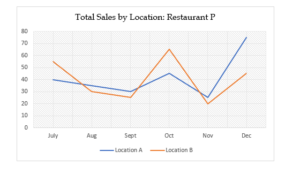
The line chart below indicates the total pizza sales, in thousands of dollars, for two different locations of restaurant P, over a six-month period in Year I.

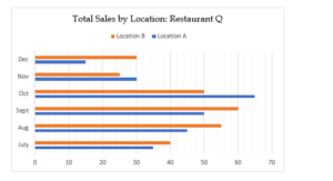
The bar graph below the total pizza sales, in thousands of dollars, for two different locations (same as that for restaurant P) of restaurant Q, over a six-month period in Year I.

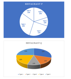
The pie charts below show the sales distribution for the month of September (Year I) for the 5 different types of pizzas sold by restaurants P and Q (assume same distribution at both the locations of a particular restaurant), which comprise the total sales of these restaurants in September (Year I):


